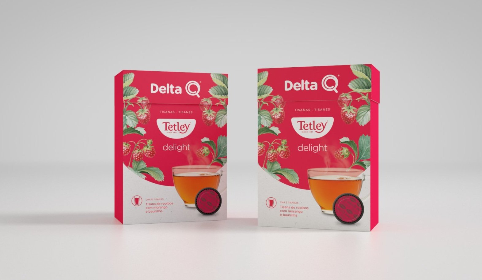
Packaging
Gama Intensidades
Delta Q
Intensities packs
Q® as a Delta Q symbol encloses a simple form with a positive and luminous connotation — a circle. Perfect shape that culminates in the metaphor of the promise of a perfect espresso. This will be the common graphic element that will figure in the different needs of the brand's applications, as in packaging, ensuring its consistency and simplicity.
— Project not implemented —
Criative Director Pedro Leal Almeida
Design Inês Coelho
3D Wilson Bigarel
Client Delta Q
Label Real Brand Thinking © 2019


